


Fonts & Stylish Text Bio
Stay Strong
Fonts & Stylish Text Bio is the kind of personalization app I would reach for when ordinary profile text feels too plain. It is designed for creating decorative lettering, short bios, and nicknames that can be copied into other apps. My first impression is that it aims for speed rather than deep design work: choose a style, type your words, copy the result, and see whether the destination accepts it.
That simple idea is useful, but it also creates the main source of frustration. The text may look perfect inside the app and still appear differently elsewhere. Some platforms handle unusual Unicode characters well, while others replace them, remove spacing, or display empty boxes. So I see this as a practical text-styling tool, not a complete graphic-design editor. The best results come from treating it as a copy-and-test utility, especially when preparing a short social profile or nickname.
Where the experience usually gets stuck
The first obstacle is knowing what kind of result you are creating. A stylish font in an app like this is generally text made from alternate characters, not a new font file that changes the appearance of every app on a phone. That distinction matters. You can copy a decorated phrase into a supported profile field, but you are not installing a system-wide typeface for messages, documents, or menus.
I would begin with a short phrase rather than a complete bio. A nickname, a one-line introduction, or a compact status is easier to inspect and less likely to expose compatibility problems. Long blocks of transformed characters can become difficult to read, and some services limit the number of characters even when the visible result looks brief.
Another common sticking point is copying the wrong thing. Decorative text often includes spaces, symbols, or surrounding marks that are easy to select accidentally. After copying, I recommend pasting it into a plain note first. This quick check shows whether the clipboard contains the intended wording and whether the spacing survived before you replace a profile description.
Related News

Why WhatsApp Messenger Still Makes Everyday Communication Feel Easy

Jurassic World: The Game Is the Better Dino Tycoon for Strategic Players

Threads in Real Life: Who Should Join, Lurk, or Leave

How SHEIN Turned Shopping Into an Endless Content Feed

How to Make Fortnite Feel Smarter on Mobile

Should You Switch to Microsoft Outlook on Mobile?
The app’s focus on stylish text, bios, and cool nicknames makes it especially suitable for short, visible pieces of writing. It is less convincing for anything where clarity is the priority. If you are writing instructions, a work profile, accessibility-sensitive content, or a long announcement, normal text is usually the better choice.
Why a preview can be misleading
When I judge a result, I do not rely only on the screen inside Fonts & Stylish Text Bio. The destination app is the real test. A style may look balanced in the generator but become cramped in a profile field, lose its decorative marks in a game, or show differently on another device. That is not necessarily a failure of the generator; the receiving service decides how those characters are rendered.
This is also why I would avoid building an entire identity around one elaborate style. A readable nickname with one small decorative touch tends to survive better than a line packed with unusual symbols. It is easier for friends to search, copy, and recognize, and it gives you a fallback if a platform handles the characters poorly.
Gallery
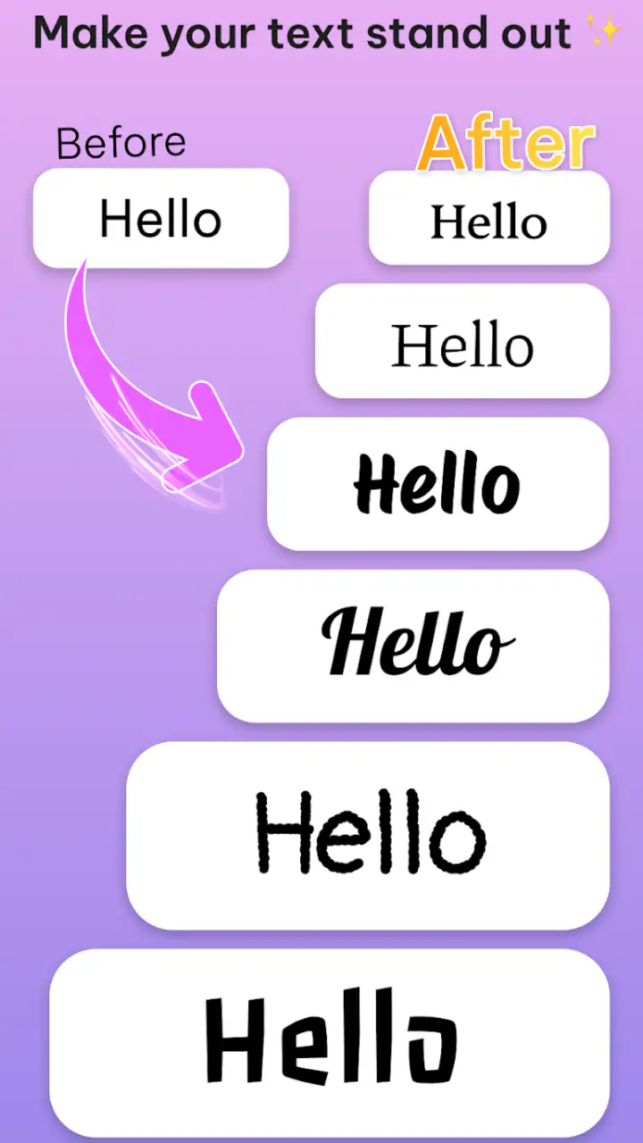
Setup checks before creating a profile line
The app is free to install, which makes trying a few styles low-risk. It is rated for Everyone, and the current release is version 1.0.2. The listed minimum operating system is Android 7.0, so compatibility should be checked before troubleshooting the app itself. If the application does not install or opens unreliably, the operating-system requirement is a more sensible first check than repeatedly changing text styles.
Fonts & Stylish Text Bio comes from Stay Strong and sits in the personalization category. Its average rating is 4.6 from around 617 ratings, with more than 10K installs. Those figures suggest that people are finding the basic idea useful, although they do not guarantee that every style will work in every social network or game.
On first use, I would keep the setup deliberately small. Type a test word, select a style, copy it, and paste it into a harmless note. Check three things: whether the letters remain in the intended order, whether spaces are preserved, and whether symbols appear as symbols rather than blank squares. This workflow separates an app problem from a compatibility problem in seconds.
It is also worth checking the destination’s editing behavior. Some profile fields remove formatting when you save, while others accept the pasted characters but display them differently later. If a result disappears after saving, repeat the test with a simpler style. That gives you useful information without assuming that the whole app is broken.
The presence of optional in-app purchases, listed at prices from $0.10 to $10.00 per item, is another practical consideration. I would explore the free experience first and only consider a purchase if a particular style or extra option solves a problem I actually have. For occasional nickname changes, paying is unlikely to be necessary; frequent profile customization may make additional choices more appealing.
A reliable first-use routine
Start with a short phrase that contains ordinary letters and one space.
Preview several styles without trying to judge them only by decoration; check whether the phrase is still easy to read.
Copy one result and paste it into a plain text area before using it publicly.
Test the same result in the exact profile, chat, or game field where you want it.
Keep a plain-text version ready so you can restore the original wording if the decorated version fails.
This routine may sound cautious for a small personalization tool, but it prevents the most annoying mistake: assuming that a successful copy operation means the destination will display the same result. In my experience, the extra test is more valuable than spending time comparing dozens of nearly identical styles.
Recovering when a copied style does not work
If pasted text appears as boxes, question marks, or missing characters, I would not immediately reinstall the app. First, return to the generator and choose a simpler style with fewer unusual characters. Decorative alphabets are not equally supported, and a more restrained option often works where an elaborate one does not.
If the wording pastes incorrectly, shorten it and remove unusual punctuation. This helps identify whether the issue is the length, a particular symbol, or the destination field. Testing one change at a time is important. Changing the phrase, style, and receiving app together makes it impossible to know what fixed the problem.
When the copied result is correct in a note but fails in a profile, the app is probably doing its part. The receiving service may sanitize text, enforce its own character rules, or render the same characters differently. In that situation, I would keep the app and change the style rather than repeatedly clearing data or rebuilding the profile.
A useful recovery trick is to maintain two versions of every important bio: a readable standard version and a lightly decorated version. I would save both in a personal note. If a platform updates its editor or a friend reports that the text is hard to read, you can switch back immediately instead of recreating the wording from memory.
There is a second, less obvious trade-off with nicknames. Decorative characters can make a name visually distinctive, but they may make searching harder. Someone who wants to find you may not know which alternate character was used. For gaming communities or group chats, I prefer a recognizable base name with decoration around it rather than replacing every letter.
Making a bio attractive without making it tiring
I get better results by using hierarchy. One decorated line can draw attention, while the rest stays simple. For example, a short identity phrase may use a stylish treatment, followed by ordinary text that explains what the profile is about. This keeps the visual effect without turning the entire bio into a puzzle.
Line breaks deserve a separate check. A bio that looks neatly arranged in the generator may wrap differently in the destination field. I would paste it, save it, reopen the profile, and inspect it as another person would see it. If the layout collapses, remove decorative spacing and let the platform handle the line flow.
I would also avoid using a style merely because it is the most dramatic. The right choice depends on where the text will appear. A playful nickname can tolerate more decoration than a profile used for recommendations, community moderation, or contact information. The app gives you creative freedom, but good judgment still determines whether the result communicates anything.
When the app is not the cause
Not every failed result points to Fonts & Stylish Text Bio. If normal pasted text also fails, the problem is more likely related to the destination app, its editor, or the device’s clipboard behavior. Try copying a plain sentence from another source. If that fails in the same field, changing stylish-text options will not solve the underlying issue.
Display differences can also come from the device or platform showing the characters. A friend may see a different shape from the one you see, even though the underlying text is identical. This is one reason I recommend asking how the final profile looks from another account before settling on an elaborate design.
There is a practical privacy angle too. I would not paste sensitive personal information into a decorative text experiment simply because the task feels harmless. Use a generic test phrase first, then create the final wording once the workflow is working. That keeps troubleshooting separate from personal details and makes it easier to compare results.
The app is not the right replacement for a visual editor when you need custom colors, images, layered layouts, or a designed banner. Its strength is portable text, not artwork. A dedicated design tool is better for a channel header or promotional graphic, while a normal keyboard is better for fast, universally readable communication.
It may also be the wrong choice for users who change profiles rarely and want zero experimentation. If a standard bio already does the job, the extra step of testing Unicode-style characters may not be worth it. I see the app as most valuable for people who enjoy refining their online presentation or need several nickname ideas quickly.
My practical verdict after using it
Fonts & Stylish Text Bio is a focused personalization app with a clear everyday use: create short decorative text, copy it, and try it where you want it displayed. I like that the concept is immediate and that the free entry point makes experimentation easy. The strongest results come from restraint, testing, and keeping a plain backup rather than assuming every ornate style will travel perfectly.
Its main weakness is not necessarily the generation step but the gap between generation and display. A preview can encourage you to choose a style that the target platform handles badly. The app therefore rewards users who understand the difference between attractive text and dependable text. That is the central trade-off I would explain to a friend before recommending it.
With optional purchases ranging from $0.10 to $10.00 per item, I would not spend anything until the free choices have been tested in the exact service you use. For a small profile refresh, the no-cost experience may be enough. If you want to explore more variations regularly, the purchase model gives you a way to expand that experimentation, but it should remain a choice rather than part of the basic workflow.
Overall, I would recommend it to casual creators, social-profile users, and anyone who wants a quick source of distinctive nicknames or bio lines. I would skip it for long-form writing, professional communication, or projects requiring true font installation and graphic layout. Used with a short test phrase, a readable fallback, and a final check in the destination app, it is a handy little tool rather than a magic solution.
My bottom line: use it to add personality to small pieces of text, not to replace clear writing or a full design application. That expectation matches what the app does best and avoids most of the friction that can make stylish text feel unreliable.
FAQs for Fonts & Stylish Text Bio
What is Fonts & Stylish Text Bio used for?
Fonts & Stylish Text Bio is designed to help you create eye-catching text for social media profiles, captions, comments, messages, and bios. It usually provides collections of decorative fonts, symbols, emojis, and text styles that can be copied and pasted into compatible apps such as Instagram, TikTok, Facebook, WhatsApp, and other platforms.
Does Fonts & Stylish Text Bio work with Instagram, WhatsApp, and other social apps?
In most cases, the app works by generating Unicode characters rather than changing the font inside another application. You create your text, copy it, and paste it into a supported social or messaging app. The final appearance may vary depending on the platform, device, and operating system, since some unusual characters may not be displayed identically everywhere.
Is Fonts & Stylish Text Bio free to download and use?
The application may be available as a free download with access to a selection of fonts and text decorations. However, some versions can include advertisements, premium font collections, subscriptions, or one-time purchases. Before downloading, check the current store listing for pricing, trial conditions, renewal details, and which features are included in the free version.
Can Fonts & Stylish Text Bio change the font of my entire phone or keyboard?
Usually, Fonts & Stylish Text Bio is intended for creating stylized text rather than replacing the system font across your phone. Some editions may offer a keyboard or direct typing feature, but permissions and functionality can differ. Review the app description carefully and avoid granting unnecessary access, especially full keyboard access, unless you understand how it is used.
Are all stylish fonts and symbols readable on every device?
No. Many stylish designs rely on special Unicode characters, and compatibility is not guaranteed across every phone, operating system, browser, or social network. A style that looks attractive in the app may appear as blank boxes, unsupported symbols, or a different design after being pasted. It is best to test important text before using it in a public profile or post.
Pros
- Offers many font styles for eye-catching social media bios and captions.
- Quick copy-and-paste workflow makes sharing styled text simple.
- Includes decorative symbols
- emojis
- and text art alongside fonts.
- Useful for personalizing profiles across several messaging platforms.
- Lightweight design allows fast browsing without complex editing tools.
Cons
- Some fonts may appear incorrectly on devices that lack matching characters.
- The most attractive styles may require watching ads or premium access.
- Copied text can be difficult to read
- especially in long messages.
- Limited editing options compared with full-featured graphic design apps.
- Frequent ads may interrupt browsing and copying on the free version.


